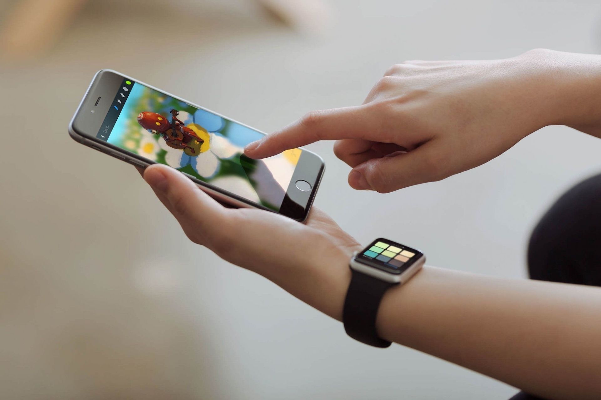
Procreate Pocket has just received its biggest update ever, and we’re incredibly excited to have finally shipped this massive release.
However, it might surprise you to know that just six months ago we were on the brink of ending development on Procreate Pocket and removing it from the App Store permanently. Procreate Pocket had been languishing without any love from Savage for years, and many of us wanted to kill the project in favour of a stronger focus on iPad.
To understand why, we need to go back to 2014 and Procreate Pocket 1.0.
The Beginning
When we first released Procreate Pocket, simplicity was the sole focus. It was something we’d always prioritised in Procreate for iPad, and we figured it was even more important in Procreate Pocket. Rather than a fully-featured studio geared for a professional workflow, Procreate Pocket 1 was designed to be lightweight and easy to use, for quick sketching or painting while you’re on the go.
Once Procreate Pocket had been on the store for about a year, we began thinking about a new approach for the app. iPhones were becoming increasingly powerful, and James was working on some fantastic new designs to bring more of Procreate’s power and professional features to iPhone.

Our enthusiasm about a full refit of Procreate Pocket, this was eclipsed by the incredibly exciting release of iPad Pro and Apple Pencil. This hardware combination was such a big deal for us that we had no choice but to stop development on Procreate Pocket and focus everything we had on Procreate for iPad.
That was the right call. Procreate was already the leading painting app for iPad, and iPad Pro and Apple Pencil allowed us to take the product to a whole new level. There was already a dedicated community of artists using Procreate, but with more precise hardware and a lot more power to work with, many more artists began to integrate Procreate into their workflows.
The combination of iPad Pro, Apple Pencil, and some monumental feature updates meant that Procreate rapidly became a powerhouse for artists working professionally in film, design, illustration, calligraphy, and a dozen other industries.
In the meantime, Procreate Pocket sat untended on the App Store. It didn’t receive an update for over two years, and we knew that this didn’t meet our standards. By the end of 2017, Procreate for iPad was powered by an entirely new Metal engine, had a plethora of powerful new features like StreamLine, Automatic Selection, Perspective Guide, and PSD Import. Procreate Pocket didn’t even have QuickLine, and its overall design hadn’t aged well. From both a technical and user experience standpoint, the product lagged behind.
There was no easy solution. Procreate Pocket had been without updates so long, it was starting to feel beyond repair. Fixing things would require more than just a minor patch - it would effectively mean we had to build the app all over again. So, the question became: is it worth it?
Worth Saving?
At our annual company meeting at the end of 2017, James announced a plan for dealing with our neglected little project. He’d started redesigning Procreate Pocket as an entirely new app, addressing the fundamental issues with the original version. Bringing it to life would require a total reboot: scrapping the old version completely, and rebuilding for iPhone from the current iPad codebase. This wasn’t just a point update - this was Procreate Pocket 2.
This was ambitious and exciting, but not everyone at Savage felt that way at first. There was a feeling that Procreate Pocket had been an experiment, and it had failed. It wasn’t a suitable tool for professional artists, and any further effort on the project could be a waste of precious development time.
Some of us - Matt in particular - strongly felt that we hadn't yet given Procreate Pocket a real chance. Because it had sat for so long without proper care and attention, it hadn't had the opportunity to stand on its own feet. We knew the problems with version one, and now we had a chance to fix everything: to make a version that we could really be proud of. Procreate Pocket 2 wasn’t a choice - it was a necessity.
The debate went on for hours, well into the night. We traded pros and cons (assisted by many delicious cocktails), but even by 4am we hadn’t come to an agreement. In fact, during the discussions, more people began to feel that removing Procreate Pocket from the App Store and ceasing development was the right call.
The tide had started to turn, and it was looking likely that this would be the end for Procreate Pocket - which was kind of sad. We ended our retreat a few days later, bringing 2017 to a close with the fate of the project still undecided.

Starting Again
We returned to work in January 2018, and at our first meeting of the year, James announced he’d made a call on the debate. To most people’s surprise, the project was going ahead! We would begin development that week and we would launch Procreate Pocket 2 in quarter two of 2018.
Within a few short weeks, internal sentiment towards the product was already changing. To begin with, we hadn’t all been convinced that Procreate Pocket had the potential to be something great, but as our engineering team began working with James to create something tangible, we started to fall in love with the project again.
As the project developed, our excitement grew. We weren’t abandoning Procreate Pocket. Instead, we were going to build something that truly earned the Procreate badge: the most powerful, and intuitive painting app ever designed for iPhone. By the time we hit our first private beta, everyone was on board. Savage were united again, and it was time to hear what artists had to say.
Sending out the invitations for the first Procreate Pocket 2 private beta was a little nerve-wracking. We’d been living and breathing Procreate Pocket for months, but this was the first time anyone outside our team was going to be using the app.Though the edges were still pretty rough, we needed to know what our wider community thought - so we reached out to our most dedicated beta testers and experienced industry artists first. While bugs were still abundant and designs far from final, they enthusiastically dived in, and before long we had an answer. The overwhelming response was incredibly positive. This was the version of Procreate Pocket they’d been waiting for.
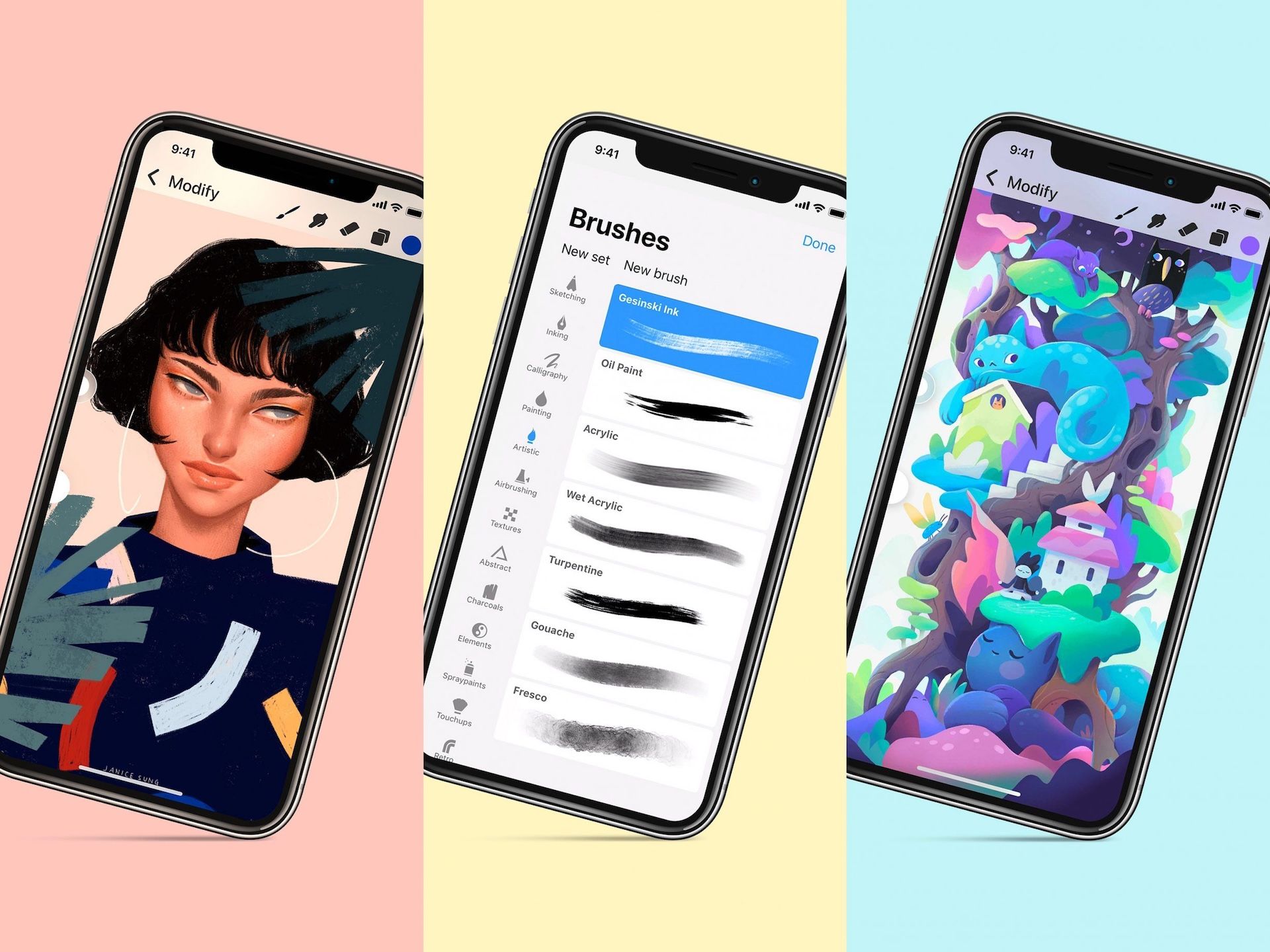
Shortly after we sent out the first beta invites, artwork created in Pocket 2 started to surface - first a trickle, then a flood. While the entire purpose of the app was to allow professional quality artwork to be created on iPhone, we were blown away by what we saw. From basic sketches all the way through to finished concept art and illustrations, it was clear that Pocket 2 was shaping up as an incredibly capable product in its own right - but we weren’t done yet.
Design & Engineering
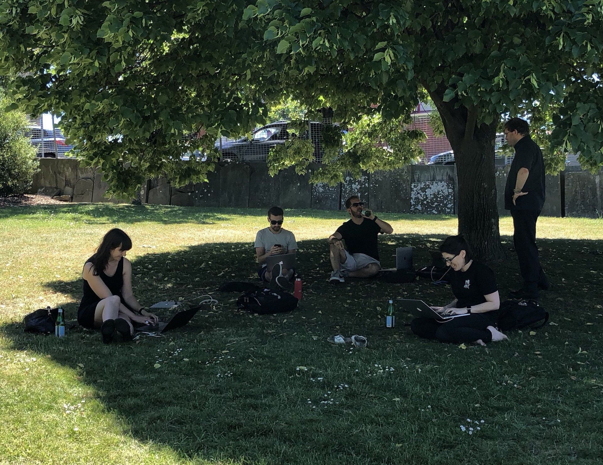
Our working conditions are always dynamic, whether we're in separate offices, sharing a space, or moving outside for a new perspective. Some stages of development require office doors to be shut and music to be turned up to 11, but the closer we get to release, the more our engineering and design teams will migrate into communal areas to work side by side. Pocket 2 was no exception - in fact, it required more collaboration at this stage than a lot of the updates we've done. Although we were bringing across existing features from the iPad, they had to be re-designed and re-engineered for entirely different hardware. We not only had to take different screen sizes and aspect ratios into account, we also had to consider the fundamental differences between iPad and iPhone.
Freedom to work the way we need helps us to trade ideas back and forth, and this is one of the biggest reasons that Procreate feels like one coherent product all the way through.
Just like a desktop setup compared to a tablet, you use an iPhone differently to an iPad, and many of the paradigms we’d already figured out just didn’t translate effectively. We had to look hard at every single feature, menu, and flow in Procreate, and in many cases figure out an entirely new way to implement them in Procreate Pocket.
Most of the gestures were pretty easy to bring across directly, and in fact two-finger tap to Undo had originally been created for Procreate Pocket - one of the few parts of the original design which had influenced Procreate for iPad. Outside of gestures though, nearly everything had to go. Translating core parts of the interface like brush sliders and menu layouts took weeks of iteration, and there were a few details, like the Previous Color indicator, that we didn’t figure out until the final betas.

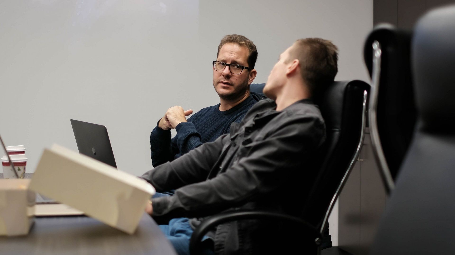
Over the course of this refinement process, takeaway containers and coffee cups formed a regular orbit around the engineering and design teams working in The Garden. There were a lot of late nights building, tweaking, and polishing - but we weren’t alone. Our amazing community of testers all over the world continued to offer feedback, hunt bugs, and share their artwork with us, motivating us to continue making this the best version of Procreate Pocket possible.
Eventually, this long and gruelling process came to an end. After almost 6 months of dedicated effort, the trial by fire was over for Pocket. The original shell, and even the core of Procreate Pocket was long gone, but the idea had been made into something new. Pocket 2 was something we could be proud of, and it truly earned the Procreate name.
The Future
That brings us up to date. At the time of sharing this story, it’s been just over a week since we sent Procreate Pocket 2 live on the App Store. Feedback from customers and the press has been great, and we're already seeing incredible creations from Procreate Pocket users. We've also seen some lovely reviews on the App Store - here are a few of our favourites.
Even better. Procreate for iPad is my life. Procreate Pocket was great. The new version of Procreate Pocket is freakin’ transcendent. I know that’s just vague and hyperbolic, but I’m so happy about this app that it’s embarrassing. Must go art now.
I love Procreate on my iPad and use it loads. I’ve had just a quick look at the new Pocket version and it looks brilliant. Very like its ‘big brother’. Love it!
Fantastic in its Simplicity! I just love this new update! Thank you so much. Procreate is just amazing and now my default sketch app & iPhone & iPad.
Wow, what an update. I have used the full version on iPad for years and appreciated how this pocket version gave me a basic canvas to roughly sketch some cartoon ideas on the go... however this latest update gives and gives more with brushes and interface upgrades galore. I’m genuinely impressed with what I can now put in my pocket.
We’d love to see anything you're creating with Procreate Pocket. We keep a close eye on all artwork shared here on Procreate Portfolio, as well as the #procreate and #pocket tags on social media.

While development has wrapped for Pocket 2.0, we’re not slowing down. As you’re reading this, we’re already hard at work on Procreate 4.1 and Pocket 2.1. We’re not ready to talk about specifics yet, but we can say that these updates are going to contain more than one of your most requested features, and they’ll be coming to both iPad and iPhone in the second half of 2018.
As always, thank you for your continued support.
Edit: A year to the day since we were up late into the night on that company retreat debating the fate of Procreate Pocket, Apple has named Procreate Pocket 2 as the 2018 iPhone App of the Year. There could be no better sign that we made the right choice.